5 Graphic design elements on how to make a creative, modern resume design
Disclaimer: As an affiliate partner, we might profit from your purchases from third-party websites, however, we do not charge you extra in the process. Read my Disclaimer Policy here.
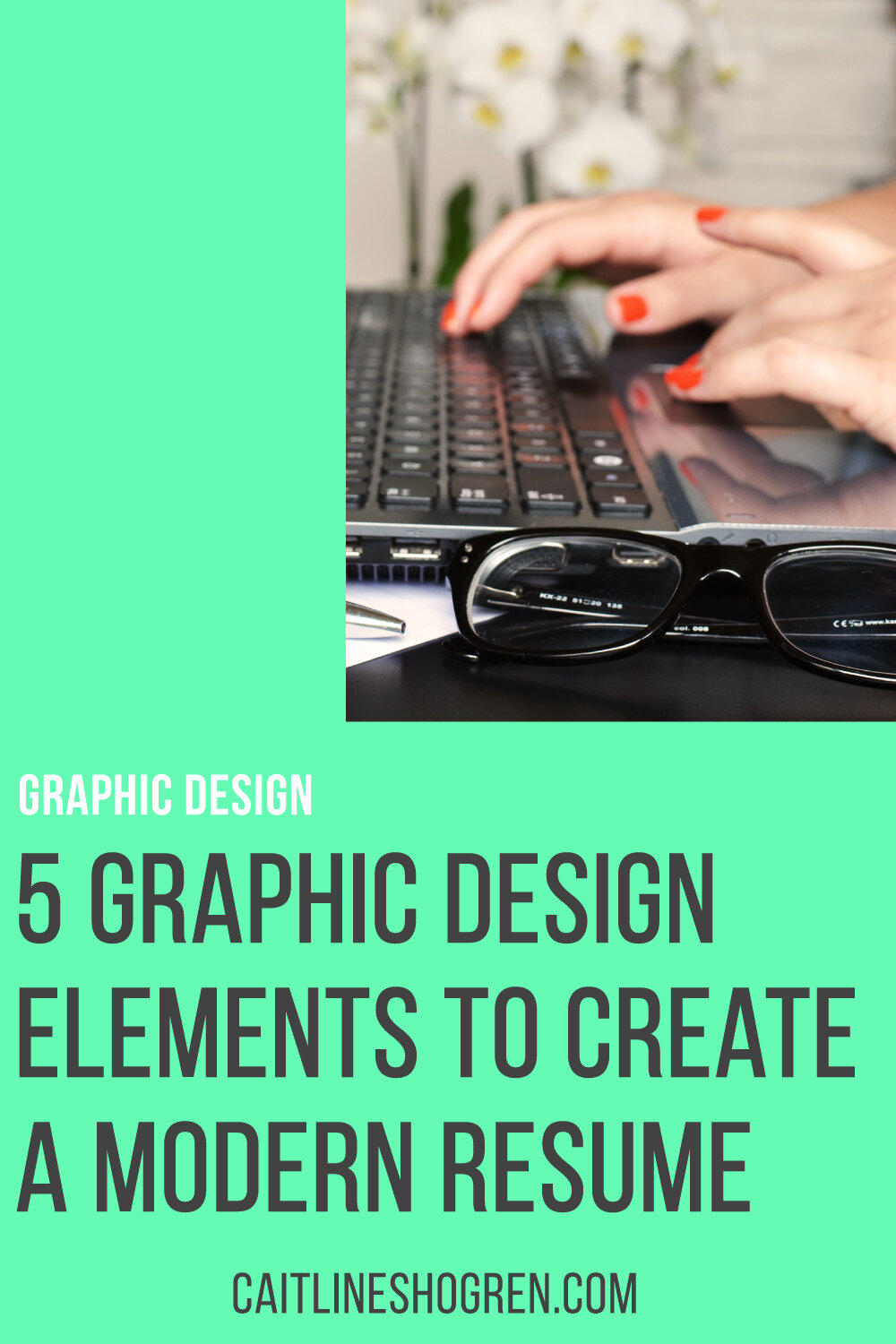
How are you designing your modern creative resume?
Resumes haven’t changed much over the years, but their design has shifted recently. A modern, creative resume design helps readers see more on a visual level than previous traditional resumes.
While the content might not have changed, the design has turned become more graphically inclined. Where we once listed our experience and education in one single column, meshing one category into the next, we now have moved to a more structured and iconographic style.
Icons and graphics aren’t always the answer for resumes since many are being reviewed by software before being seen by a human eye.
New design elements have been making an impact on this new modern design style for creative resumes. Here are a few to take note of when you need to rework your resume.
Related Content: Best Graphic Design portfolio books to start your graphic design career
Asymmetrical Layout
Most traditional resume designs are one column from the top to the bottom of the page. This isn’t a bad way to layout a resume, but it’s not very effective. Once you develop some relevant job experience, it can become cluttered and difficult to read.
An asymmetrical layout design allows the reader to develop a line of intent down the page. Your reader isn’t fighting to read through your copy in one column but can break it up into readable sections.
Most templates and examples I have seen place the contact information and education on the left, with the experience and skills on the right. This is dependent on the template and the job experience.
White Space
Part of the draw to the asymmetrical resume design layout is its use of white space. By distributing your content into two columns instead of one, you create space that doesn’t have to be filled and lets your content ‘breathe.’
Some people will want your resume to be filled to the brim. There will be no space and everything will be cramped. This is a common request with some of my work, but remember, you don’t need to fill every inch of space.
White space is great on a well-written resume. Not only does it look professional and clean, but it can also allude to a well written and concise work experience. This might not be always the case, but for the well-constructed resume, it can speak volumes.
Related Content: 7 Examples on how to create a unique portfolio design
Concise Bullets and Text
Writing for your resume is a great way to learn how to write short and thorough text. You need to be able to narrow down your job performance in one sentence and maybe 3 bullet points.
Red pens are your friend in this situation. Determine word-by-word what word or phrase will paint you in the best light for your application. Imagine you were writing a tweet about your job responsibilities and cut accordingly.
Bullet points are still a great way to be concise about your experiences. Most employers would gladly read a short list than a paragraph about your past professional experience. Again, whittle down your copy and determine what is essential rather than trying to fill space.
Personal Brand Image
If you’re creative at all, you might understand this modern resume element a bit more than others. Many modern resumes have started adapting to a personal brand image. Sometimes this is subtle, like a select color palette, but others incorporate various aspects, up to a personal logo.
Either range is fine. Employing a personal brand style to your resume might be too far-fetched for some applicants, especially if you aren’t applying for a creative position, but could put you over the edge for a creative position.
At the very least, you could determine which colors and typefaces you would prefer to use to create a cohesive look between your resume and other application materials, such as your cover letter or business card.
Related Content: Key elements to include in your personal brand
Colors and Graphics
As people become more visually inclined, I’ve started to see more modern resume designs with graphics, colors, and icons to showcase skills. Whether applicants add icons for their contact information or graphs for their skills, visually presenting your resume can be great but also present problems.
Applicants need to be aware that graphics and icons will not register on many resume reading programs. Softwares are usually the first things that read your resume when you submit a job application. You no longer go through a human being first in most cases.
While it might look cool, keep the graphics and icons to a minimum. Colors are great a addition when used sparingly, but icons and graphics might be your downfall if you use them abundantly throughout your modern resume design.

Creating a modern resume can be daunting, but putting a bit of creativity into the design will help improve your resumes look and your chances for an interview.
Are you looking for more tips on how to create a modern resume design? Join my e-newsletter for resume design and writing tips that can help you get your next interview.